


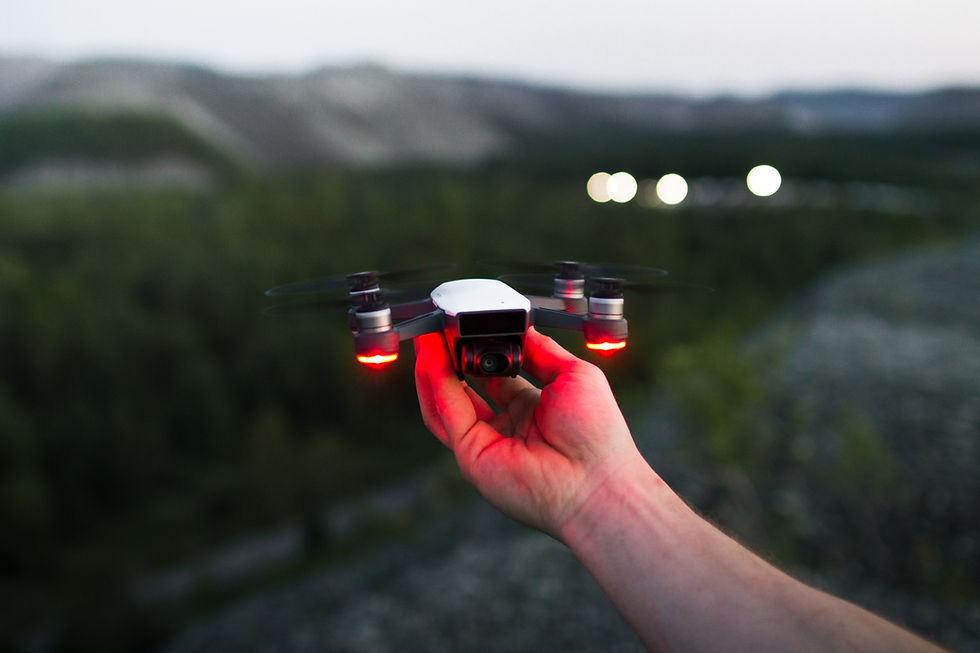
Drone imagery,
booked in a minute.
TO DESIGN AND CREATE A HOLLISTIC BRAND LOGO AND IDENTITY
Parna is an authentic spa experience using ancient ayurvedic techniques to destress people through head and full body massage
Ayurvedic massage also known as abhyanga, employs holistic and integrative medicine principles used 3000 years ago in India. Parna uses this technique of massage using precious natural oils to balance out doshas within your body to achieve spiritual fulfilment and relaxation. Derived from ancient Indian rituals, bonded with nature and spirits the aim of the brand design was to incorporate all this into one. After brainstorming and understanding the brand concept and values, the name PARNA was finalised followed by the brand colours, typography and logo.

brand naming
"PARNA"meaning leaf or feather.
Derived from the ancient language Sanskrit, this word has been chosen as the brand name.
To symbolise lightness, light, delicate, nature and flow. Once someone experiences the ayurvedic head or body massage, it instantly relaxes the person and makes them feel light like a feather. it helps them attain a feeling of calmness and lightness like something heavy has been lifted off the shoulders.


Brand Values


Logo Type & Development

Colour Palette
"PARNA"meaning leaf or feather.
Derived from the ancient language Sanskrit, this word has been chosen as the brand name.
To symbolise lightness, light, delicate, nature and flow. Once someone experiences the ayurvedic head or body massage, it instantly relaxes the person and makes them feel light like a feather. it helps them attain a feeling of calmness and lightness like something heavy has been lifted off the shoulders.

Primary Typeface
GT America Extended
"PARNA"meaning leaf or feather.
Derived from the ancient language Sanskrit, this word has been chosen as the brand name.
To symbolise lightness, light, delicate, nature and flow. Once someone experiences the ayurvedic head or body massage, it instantly relaxes the person and makes them feel light like a feather. it helps them attain a feeling of calmness and lightness like something heavy has been lifted off the shoulders.
Secondary Typeface
Helvetica Neue
"PARNA"meaning leaf or feather.
Derived from the ancient language Sanskrit, this word has been chosen as the brand name.
To symbolise lightness, light, delicate, nature and flow. Once someone experiences the ayurvedic head or body massage, it instantly relaxes the person and makes them feel light like a feather. it helps them attain a feeling of calmness and lightness like something heavy has been lifted off the shoulders.
Brand Illustrations


The custom illustrations I crafted bring the drone education journey to life with a clean, modern style—featuring vibrant geometric scenes of training environments, instructors, and participants in action.
They blend organic forms with sharp technical elements, reinforcing MinuteDrone’s identity of professional yet approachable training; the visual storytelling helps communicate complex offerings in a friendly, intuitive way.
These illustrations see regular application across the site and marketing collateral, grounding episodic visual consistency and enhancing user understanding.


Website Design & Development
I led end‑to‑end design and execution of the website redesign in close collaboration with the developer, visual team, videographer, and the founder:
1. Discovery & Strategy Workshops
-
Held alignment sessions with the founder, visual and video teams to define goals, messaging, and UX priorities.
-
Mapped user journeys (e.g. booking a drone service, requesting training, accessing inspection data).
2. Wireframes & Visual Design
-
Created wireframes emphasizing clarity and visual hierarchy, then evolved them into high‑fidelity mockups in Figma.
-
Integrated rich drone footage and project videos produced by our videographer—carefully edited and captioned for maximum impact.
3. Developer Handoff & Collaboration
-
Delivered a modular component-based design system, including reusable Figma libraries. I coordinated closely with the developer during implementation to ensure pixel-perfect execution, responsive layouts, and performance optimization.
4. QA, Testing & Launch
-
Conducted usability testing and refined content spacing, CTAs, and workflows.
-
Ensured imagery and visuals met both branding consistency and loading-speed benchmarks.
5. Impact & Outcomes
-
Landing page bounce rate dropped by ~30%, significantly increasing time on site and improving enquiry conversions.
-
The refreshed site visually communicated MinuteDrone’s expertise and accelerated trust‑building with clients in sectors like agriculture, construction, and infrastructure.
Design is the silent ambassador of your brand.
NEWSLETTER
Receive a monthly email with a personal reflection on branding & design. Subscribers gets exclusive content & offers.
LET'S CONNECT